
Most people vocal enough to post had negative reactions to the proposed ad we put up last month. So, we put together some images that are less literal and more moody. Many possibilities are shown here for you to look at; if you like any of them especially, please post and let us know.
Note: The wide-but-short ads are probably too wide for the display settings on your browser, so they are probably downsampled and look bad. Click on them to see fully-sized versions.


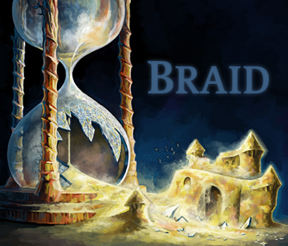
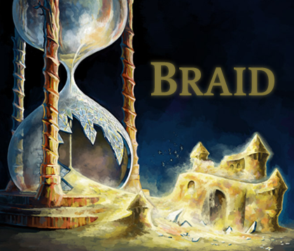
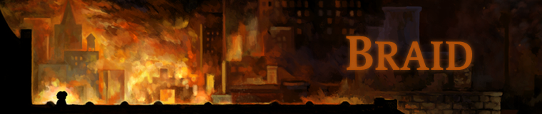
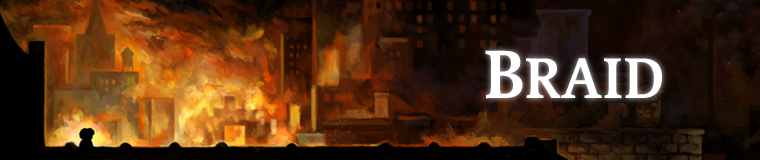
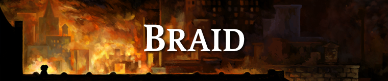

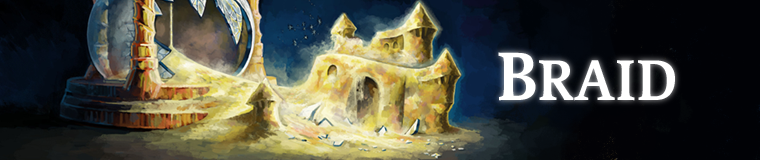
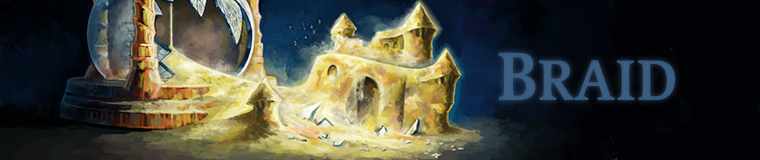
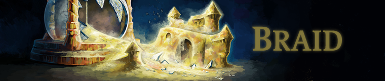
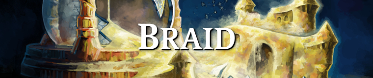
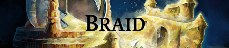
For what it’s worth, city 3b and castle 2f look the best to me. The blue is less clashy when you’ve a large space; the white stands out better when you’ve a small space. Also, the architecture of the bridge is really interesting, visually.
I still think maybe you could show actions being undone, somehow or other. Though maybe more abstract is better. The point of the game isn’t the design, after all; the design just serves the point, which is itself more abstract.
Really like the first square hourglass one. I think it’s more important to communicate “Hey, we’re fucking with TIME” than “Hey, it’s a platformer.”
The banner ones are tricky, though – I guess you can’t shrink the hourglass to fit its characteristic shape in? If you can, I wouldn’t worry about not being able to make out the sandcastle – you already get the idea from the breach in the hourglass.
The cityscape ones are really pretty but don’t say anything, so of the ones here I’d probably lean towards the first of the hourglass ones, just to match the larger ad.
I’d say 3a is best, followed by 2e or 2f. I like how the brown lettering blends in with the mood of 3a, while in het hourglass images I don’t mind the brightness, because the entire image is rather bright.
The broken hourglass does remind me of Prince of Persia: Sands of Time. I’m not sure if that’s something you would want in your add. The cityscape looks more originally Braid. And I really like the dynamic between the inferno on the left and the cool nightly atmosphere on the right.
One thing you may want to work on is making sure the character stands out from the surroundings. I know it’s the main protagonist, because I know about the game. But people who haven’t seen it yet might not even notice him. Perhaps he should be drawn in the mario-style jump pose from the previous add. That’s something people in general should recognize.
Hi Johnathan!
Firstly, just let me say I’m dying to see this on XBLA. I got a 360 specifically for it 🙂
As for the Ads, I agree with Sergio in that the hourglass reminds me alot of sands of time and unless that is your intention it’s probably not a good idea. Having said that it may be what you’re after since people already recognise the mechanics behind PoP and the whole idea of time manipulation (If not, they get it from the design).
My personal favourites are 1e and 3a. The burning cityscape invokes alot of emotion (Curiosity, mystery, to name a few) and intrigues me, which is the idea of an ad.
Anyway, I’m really loving the new artwork for the game. The banners look great. Keep up the great work and I look forward to playing Braid!
I think the first hourglass has the best font, the one with the slight glow to it. I also really like this one: /news/wp-content/uploads/2008/02/banner-760×160-city-3b.png
I am partial to banner-760×160-city-1d.png and banner-760×160-sandcastle-1e.png.
This may sound silly and you may be too far into your imagery but here’s an idea. A classic roman numeral style clock with multiple short and long hands set at different points on the dial. That could get the game’s main mechanic and art style across in one simple image.
My votes: sandcastle 2f, city 3a, and sandcastle 1e.
I really like Dave’s hourglass picture (it has been in rotation on my desktop since you posted it here), and as such, I really like the hourglass ads. Unfortunately, I don’t think they can really work in the banner format, as it’s not quite obvious enough what the hourglass is, which makes the ad confusing. Also, it would probably be best if the hourglass picture isn’t the only advert, as all it really communicates is that time is being messed with (it does also demonstrate the gorgeous visual style of the game, but few will assume that the in-game art is so similar to that used in the ads).
To show that the ‘painted’ style is used in game, it makes sense to use the city scene from the title screen as the banner ad, but it may be sensible to make it more obvious that this is visually representative of the game. One way of doing this would be to make the character (Tim?) more obviously the player’s avatar – perhaps by showing him jumping (which also helpfully shows the player that this is a platformer) from the end of the bridge, and into the better lit section of the screen – allowing the colours of the character to stand out and more easily catch the eye.
Of the ‘city’ banners, I like the wide angle ones better, but unfortunately the extra detail could easily be lost on SDTVs or other inferior displays (I wonder what proportion of Xbox Live users have HDTV’s?), which could make the cityscape appear dull and muddy – not the look you’re going for – so it might be best to use the closer version (if only the Xbox could swap out the high detail ad for a simpler one based on the video output in use… ).
With regards to the text, I think I actually preferred the font you used in the first couple of ads, but I quite like the bloom effect on some of the new ads. Colour-wise, when using the glowy text, I think it looks nicest when the text colour matches the lighting in the area of the picture it is placed, i.e. on the square hourglass one and the wide angle city banner, glowing white text looks most natural to me, yet on the closer city banner, it might be better to go with the orange.
I like these much better than the one from the previous post. My personal preferences are Sandcastle 2E, City 3B, and Sandcastle 1C. Definitely more evocative. I’d click these to see what they were all about, especially the ones featuring the hourglass/sandcastle image.
I like city 1e and castle 2e. I don’t think any of the castle banner variations work because with the cropping it looks more like a broken snow(sand)globe than an hourglass. The city banner variations are fine, although on font alone I would go with city 3b.
I also will put in my vote for the square hourglass one, but I still think that the text could use some work, color wise. The white here seems way too bright, but the other colors (the blue and the brown) end up a little too dark, esp. the brown which comes so close to the glow color it looks a little fuzzy. I would either lighten those colors, or make the ‘glow’ a dark color with ‘normal’ or ‘overlay’ layer styles to make the text pop a little bit more (without being white).
If you wanted my unsolicited advice and not just a vote.
The hourglass one aren’t very good. All the rest look pretty sweet. Better with the logo on the far-right for the wide ones.
In my opinion, the hourglass banner ones would work better if the hourglass were on its side, as if it toppled over and broke. You’d be able to more clearly identify it as an hourglass then.
The moodiness of the cityscape ones works for me, but I don’t read the character in shadow. (And I don’t think it would work to have him jumping or something — jumping’s kind of whimsical.) The amber is better than the white.
I guess overall I prefer the lightness and whimsy of the hourglass, and I think you’re better off with a banner strip. This would allow you to go even wider.
But I would worry in either case that a) it may not convey the game’s tone (though most of what I’ve seen has been fairly light, and so maybe the hourglass works better?) and b) it doesn’t inform about the type of game to those who haven’t seen or read about it. You seem to have swung the pendulum completely the other direction.
City-3a is absolutely stunning. It sucks you into the Braid universe and really gets your mind thinking about what this place is.
City 3a and sandcastle 2e and 2f are my favourites from this batch. They’re evocative. I can say with some certainty that, knowing nothing whatsoever about the game, I would definitely click on those ads if I saw them during an unhurried moment (which is just about the only time one generally clicks on ads, I think). They give the sense that whatever is on the other end must be worth a look. The fact that the protagonist is either not pictured or thrown into shadow in both ads might be a concern, but I honestly think that the effect in the city ads given by that depiction is totally worth it.
If you’re worried about not giving a sense of the gameplay, that one from last month (which was uncommunicative but cute) could be thrown into a spare spot in the rotation. It would get the platformer part across, at least.
No particular comments Jon, just wanted to say that all these ads look much better than the previous round, and I think they all do a much better job of conveying the idea of Braid to the as-yet-uninitiated. Two thumbs up!
There’s a way in which I like 3a (and its ilk) a lot, because it is literally the first scene that you walk through in the game, so there is a certain truth to it. This is the first thing we wanted you to experience in the game, and therefore it makes a suitable ad for telling you what the game is like. Also — it has some more complicated details (like the stars behind the title, and the detail in the houses at ther ight) which hint at the parts of the game that are pretty complicated, somehow. Whereas stuff like 1c doesn’t have that high-frequency detail.
I should clarify that the choice isn’t between a big square ad or a wide banner. We have to do both shapes, plus something like 10 other sizes, because things are so ridiculous. But we did these 2 sizes as examples because they are representative of the range of shapes.
I’ve been following this blog for a while now, and the game seems very promising, but when I look at the ads you placed here, I have to wonder: Why is the game called Braid?
I can’t connect the word braid and a sandcastle in my head somehow. It makes no sense to me. I also don’t think you ever fully explained why the game is called like that. Does it have anything to do with the entire experience or the ending of the game if there is such a thing to it?
Also, to go a bit off-topic:
Since you’re putting your game on XBLA, does Microsoft require you to come up with “achievements”? I would like to know how you would go about handling them as you have expressed yourself a person who is against points and non-actual progression and rewards. might those achievements coincide with actually useful rewards that you can do something with in the game?
Looking forward to playing it and seeing your next projects.
Leroy
There are reasons why the game is called Braid, but they aren’t in the realm of the logical / verbalizable. There are “hints” as to the name in the game itself, though “hints” probably isn’t such a great way to think of them.
Microsoft does require Achievements for XBLA, but I didn’t have a problem with adding them for this game, mainly because there were natural places to put them in the game already. I am not strictly against rewards — I am just against empty rewards. When a player actually does something interesting to get a reward, then I think a reward is okay (as long as the reward is in proportion to what the player did).
The achievements don’t give you anything tangible in the game — they are mainly just acknowledgement of something you did (like “Hey, you solved all of world 2.”) If I were to make them affect gameplay more, then I would be changing the game to accomodate Achievements, and I didn’t want to do that — the game needs to retain its philosophical core or I am not interested in putting it on whatever platform, and if I have to alter it too much then that core would be lost.
That said, in my ideal world Achievements would not exist on the Xbox 360, because I think they are just sort of a leech (like Frequent Flyer Miles). But, given that they exist, I don’t have a problem using them in this case.
These are all good, although the point about it being hard to deicpher that it’s an hourglass is good… maybe redraw a similar same scene with the broken hourglass toppled on its side (hey, there’s a metaphor for you, too) so it can fit in a banner?
I prefer the text “Braid” being subdued, so the eye takes in the other elements before seeing the name, rather than being drawn to the name first (as I think the white text does), but here we’re into the psychology of advertising that I’m definitely not an expert in.
city 3a
castle 1c or 1d
if you really want a larger image 2e (but maybe knock the white text back a tiny bit)
I agree that you need to see the architecture of the bridge n city scape.
Btw it does remind me of jasper morello and a little of limbo.
The landscape format inherently implies platforming too and the sense of exploration within a left to right visual space.
I like braid, to me it has connotations of interwoven threads(narrative or otherwise), craft, and friendship. But its defnitely not an immediate slap, like say ULTRAFRAG2008 might be 🙂
Sandcastle 1e and 2c are my favourites. The hourglass sand forming a castle is a neat idea and white looks best and from what I’ve seen of the game, white seems to characterise the game the best.
My favorites are sandcastle 2g and city 3a. I don’t like any of the ones with the white text, with the possible exception of sandcastle 1c. The white either stands out too much or is too sharp and contrasts with the painted style of the game. Good job on these.
I want to play the game depicted in city-1d and sandcastle-2e. Not so much the one depicted in the other images.
Very nice to see fresh new games coming out, that goes back tothe old school days when games were more than just pretty graphs. I’m an avid gamer, manager in retail and love telling people about the small companies. We even have a free magazine(our own underground mag) we hand out to customers on a weekly bases, about what to look out for and what to buy. Very interested in interviewing you all on this game, let me know
Good luck and hope to hear back soon.
M. Spurling